Empowering children to do inhalations more regularly
Type of project
In-house UX design for an existing child healthcare app
Role & Team
Working as a junior designer with help of a senior designer. Collaborating with PM, UI and DEVs
Time
5 months (Spring 2021), part-time (around 1 day/week)
Deliverables
Usability test report, wireframes, screen flows.
Context: CF Hero is an app for kids with Cystic Fibrosis
Its goal is to slow down the progress of cystic fibrosis, a disease worsening lung functions.
Problem: Kids were not doing inhalations consistently
The previous streak mechanism didn’t motivate kids to do inhalations regularly and unlock higher levels.
Project outcome

The design
Changes in existing user flow
The project resulted in redesigned streak mechanism and some changes and new screens in the existing user flow.
how final solution solves the problem ↓The impact
Children are doing inhalations 2x more regularly
Kids are sticking to their inhalation plan and exercising with the app more regularly, meaning they are staying healthier.
complete impact ↓Process
- Creating roadmap
- Market Research
- User Reserach
- Data synthesis
- HMWs
- Ideation workshop
- Further ideation with stakeholders
- Stroyboarding
- Service blueprinting
- Low-fidelity prototypes
- Storyboards
- Designer's journey
This case study highlights:
🤝 COLLABORATION
I highlighted for you the moments where I involved other people in the project with the 🤝 emoji because I believe design is a lot about involving the right people at the right time.
🎉 LEARNINGS
All my successes (highlighted with 🎉) I take as something to reflect upon and note down as learnings for next time. You can also find a more detailed visualization of my learning process at the end of this case study
💩 FAILS
Admit it, you're most curious about where I failed and what I learned from it, right? :D Well, lucky you, it's all highlighted with the beautiful 💩 emoji :).


Process
Understanding what causes children to not use the app regularly
Together with the senior designer we analysed the existing user journey and app flow and came up with the below-depicted hypotheses which we later validated with users in the first part of a usability test interviews.


Users are not 100% sure how to get to higher level becuase the only cue:
- can be easily overseen
- is provided on screen where user is already focusing on something else (results of inhalation he just finished)
How might we help users to understand how to get to the next level?
To answer, we found these points important:
- Some of our youngest users have trouble reading.
- Creating something more tangible and visual to explain to them how to get next level would probably work better.
So we narrowed down our question to:
How might we visualise level progression?
DISCLAIMER: Why we didn't talk to users in the beginning? CF is an extremely rare disease and our target group is only dozens of kids in Czechia which makes recruiting extremely difficult. It made sense to leverage our hypotheses and iterate on the designs internally before talking to the users.
Sketching how to visualise level progression
Sketching allowed me to quickly discover ideas for possible solutions. The goal was to make the level progression information more clear, self-explanatory and prominent.


One of my early ideas was to have a ladder on which the app avatar would climb as the user would progress to a higher level. We wanted to make the progression to the next level more tangible.
Iterating in the context of the existing flow & Coming up with a metaphor of keys
Bringing my sketches into Figma in the context of the existing flow helped me make sure the new designs would fit into the existing app. At this point I was the one mostly generating ideas and sketches and Petr, our senior designer was mostly providing feedback and ideating with me how they could be improved.

In the first iteration, I was just inserting sketches of screens into the current flow diagram of the app to communicate my ideas. Here you can see we wanted to show after each inhalation a new screen with progress to the next level and show that a new box of comics will be unlocked once the new level is reached.
COLLABORATION: In this stage, it proved to be crucial to discuss ideas with all the stakeholders. Working in tandem with my colleague Petr, a senior UX designer proved to be enormously beneficial for both me and the designs Together we discussed each iteration to bring it a step further to the final solution.

The second iteration involved already very basic wireframes (the white screens inserted into the previous app flow) which made iterating faster.

In the third iteration, I thought of the idea to use keys instead of regular squares for showing the progress. The metaphor of “unlocking” the box with the keys would hopefully make it easier to understand.
Using visualisation of keys as a metaphor for "unlocking" higher levels later proved to be key for immediate understanding of how to get to the next level.
UI designer dropped out, so I did the high-fidelity prototype
When the wireframes were ready, we needed to ask our UI designer to turn them into high fidelity designs so that we would test the final version and not half bakes designs. However, the UI designer wasn’t available suddenly because of personal reasons so I stepped in and quickly turn the wireframes into almost final looking designs.

The changes compared with the previous app version are highlighted with red rectangles.
Testing designs with kids with CF

Prototype ready for testing
We tested with 7 kids from our target age, from 10 to 16 years old which meant we covered the whole age spectrum of the users and were able to discover the majority of usability issues.
Our interview script allowed us to remember to ask specific questions to validate our hypothesis and the things we wanted to achieve with the prototype. Here are the main ones:
Hypothesis
Findings
1) Do users understand in the old version of the app how to progress to higher levels? And do they understand that they are unlocking the comics boxes with new levels?
→
Most of them had only a vague idea about how to generally progress to a new level, while some were not sure at all. (We already knew from analytics no one had a higher level than level 3)
2) In the new design (unlocking comics boxes/new levels with keys) do the kids understand how unlocking new levels works and how they can achieve it?
→
There were some phrases in the copy that made it hard to understand. These we needed to tweak.)
3) Is it clear that if they miss some inhalations and break the streak they can buy the lost keys from the dark market? (newly introduced game mechanic)
→
This was clear and no change was required. We only adjusted the price as multiple kids said they would never buy it because it’s too pricy.
Making changes based on findings from the usability test

Part of the design with highlighted usability issues and quotes as evidence to support communication to stakeholders on the left side. Design adjustments with descriptions on the right side.
Preparing documentation for developers
After the usability tests, and collaborating with our illustrator and newly hired UI designer we had the final designs which I handed over to developers in a form of user flows with described behaviour.

Final flows explaining all the scenarios as a reference for developers.
LEARNING: not involving our developers in the design process earlier (other than one quick feasibility check) meant there wasn't sufficient clarity about our designs even after a handover session. This resulted in many clarifying questions later throughout the implementation process.
Because of this in the next project I had regular meetings with our two main developers to discuss design, get their feedback and even gather some very great ideas from them which improved the design significantly. All while improving the clarity of design for them and increasing their ownership.
After project
How the final design solves the problems
Here are the initial problems and how we solved them.
Problem
Solution
It was too difficult to progress to a higher level (need to complete all planned inhalations every single day)
→
The first five levels now require only one exercise a day for completion (to build the habit of exercising regularly). The following levels require all inhalations in a day (as before) to build the actually needed habit.
Children didn’t understand how to progress to a higher level
→
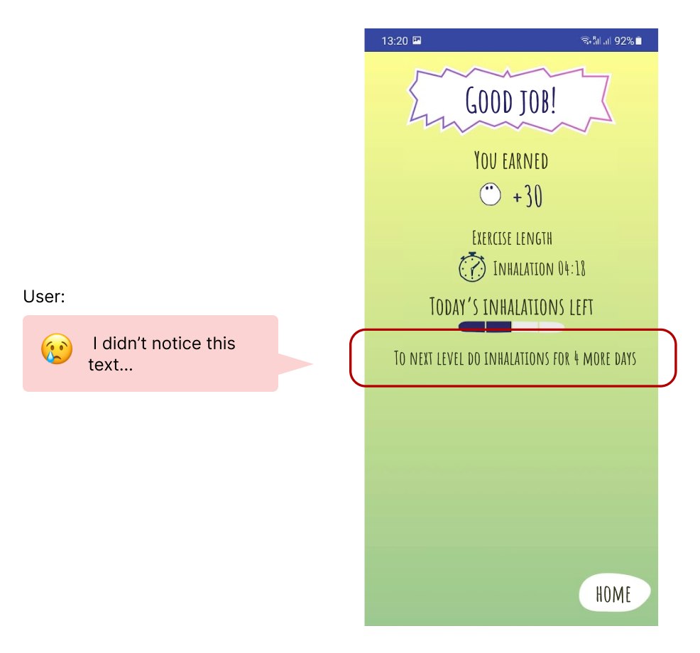
Kids now see a new screen (shown below) after the inhalation with keys as a metaphor for how many days (keys) of inhalations are already completed (collected) and how many are left.
Children didn’t understand that when reaching a new level the reward is a new box with comics
→
The reward (box of comics on lower levels and new clothing item on higher levels) is visualized next to the keys making it easy to understand what the reward is for all children.
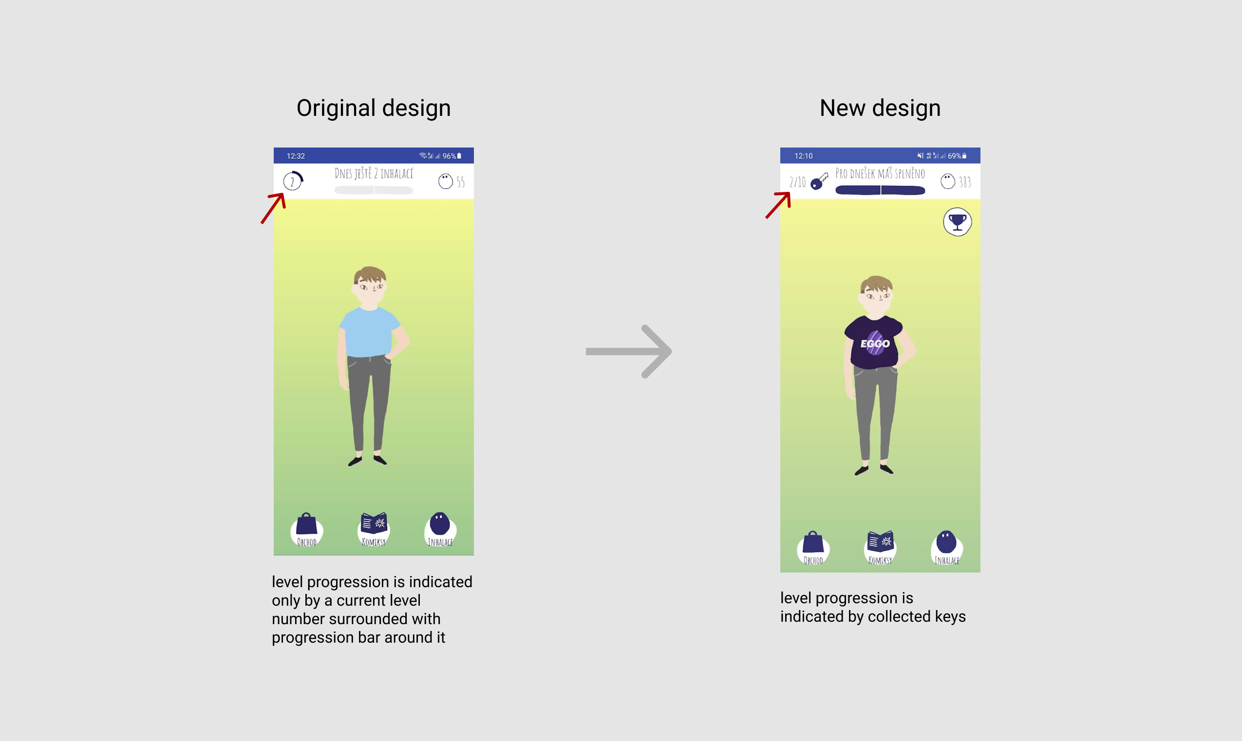
Before & After - the home screen

Before & After - the result screen
Kids are now doing inhalations more regularly
Understanding of levels
Kids now understand how to progress to new levels and what the reward is, thus they are more motivated.
Level progression
All users were previously on maximum 3rd level. From the analytics, we know that after a few weeks, most of the users were above the 3rd level and currently (Jan 2022) the highest achieved level is 15.
Regular inhalations
Progressing to higher levels matters because it means kids are sticking to their inhalation plan and exercising with the app more regularly, meaning they are staying healthier.
I learned that close collaboration with DEV and UI is essential
As I started working in CF Hero and all the work was remote, I didn’t know closely everyone on the team and almost all the communication was done through the product manager. From this project I learned I need to establish closer collaboration with developers and the UI designer to prevent misunderstandings and so that everyone is on the same page.

Petr, the senior designer I have worked with, says I'm an organised designer and empathetic facilitator.
Petr Kosnar about working with me:
"I was impressed how fast Ondřej got into an extremely complex and unusual context of a rare genetic disease, and was able to understand the limitations and challenges and started coming up with well established solutions. Ondřej was also very successful in steering the communication of broader team and improving information exchange leading to more efficient product development. He proved to be a good and empathetic facilitator of the research sessions with teenagers, which is a truly challenging target group for research, especially in the healthcare context. Working with Ondřej is a joy - he is well organized, has great and original yet realistic ideas, well established analytical thinking and solid toolbox of research and design methods. Thank you Ondřej for a great collaboration, I hope to work on more projects with you in the future!"
