Enabling community for children with rare disease
Type of project
End to end in-house UX design for an existing child healthcare app
Role & Team
Working together with senior designer but gradually taking over all his responsibilities, collaborating with PM, DEV & UI
Time
6 months (Autumn 2021), part-time (around 1 day/week)
Deliverables
Summary of past research, competitor analysis, concepts, concept testing report, usability testing report, wireframes
Context: CF Hero is an app for kids with Cystic Fibrosis
Its goal is to slow down the progress of cystic fibrosis, a disease worsening lung functions.
Problem: Kids feel lonely with their disease
Since CF is a rare disease, the patients didn't know anyone else going through the same struggles and felt like the odd ones.
Project outcome

The output
Roadmap + Wireframes
Prioritised roadmap of validated community features, wireframes for the most promising two features
The impact
Sense of belonging
We expect an increased sense of belonging and more frequent and engaged inhalations
(based on collected feedback; features are still under development)
Process
- Creating roadmap
- Market Research
- User Reserach
- Data synthesis
- HMWs
- Ideation workshop
- Further ideation with stakeholders
- Stroyboarding
- Service blueprinting
- Low-fidelity prototypes
- Storyboards
- Designer's journey
This case study highlights:
🤝 COLLABORATION
I highlighted for you the moments where I involved other people in the project with the 🤝 emoji because I believe design is a lot about involving the right people at the right time.
🎉 LEARNINGS
All my successes (highlighted with 🎉) I take as something to reflect upon and note down as learnings for next time. You can also find a more detailed visualization of my learning process at the end of this case study
💩 FAILS
Admit it, you're most curious about where I failed and what I learned from it, right? :D Well, lucky you, it's all highlighted with the beautiful 💩 emoji :).
Case study chapters
Process part 1: Concepts


Process part 2: Features


After project


Process
Planning how to go about this massive project
At this stage, Petr, the senior designer, was in charge and created a plan for this whole project of creating community in the app.
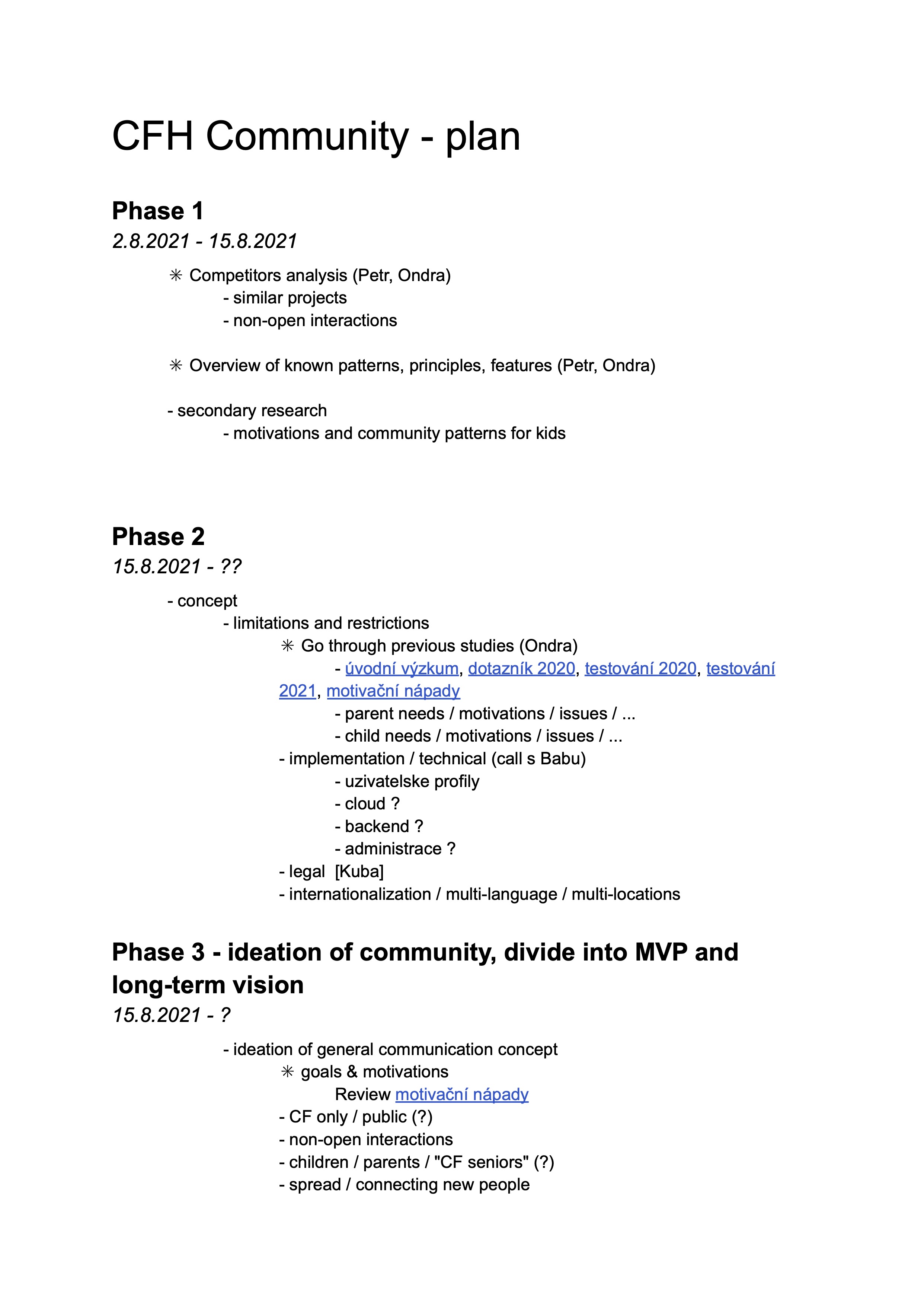
Page 1
Page 2
As the project progressed and I took over all the UX responsibilities, later I made some changes to the plan, for example I added usability testing.
Figuring out what we already know about CF kids’ desire to belong
First together with the senior designer Petr we looked at past research data. I organized in one place all the relevant pieces of information from the past research reports so that we could have a bigger picture overview of what we know.
This step was important because this way we could utilize all the knowledge we already collected and didn’t have to start from scratch.
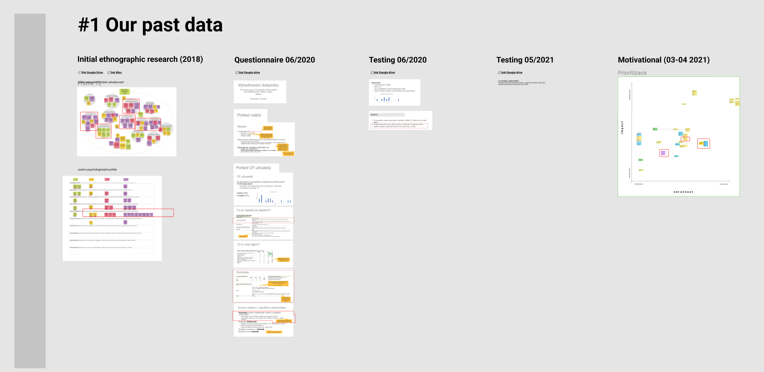
The most important finding: older kids especially have a psychological need for belonging, currently, they don't have any friends with Cystic Fibrosis
Setting Design goals - we want kids to feel belonged
Based on the part research data we set out the following high-level goals to fulfil the user needs:
- Make users feel like they are not alone and it's normal to have CF (To feel they are belonging).
- Let users be encouraged by peers to feel more motivated for inhalations (which literaly prolong their life)
Getting inspiration from other (child) app’s social features
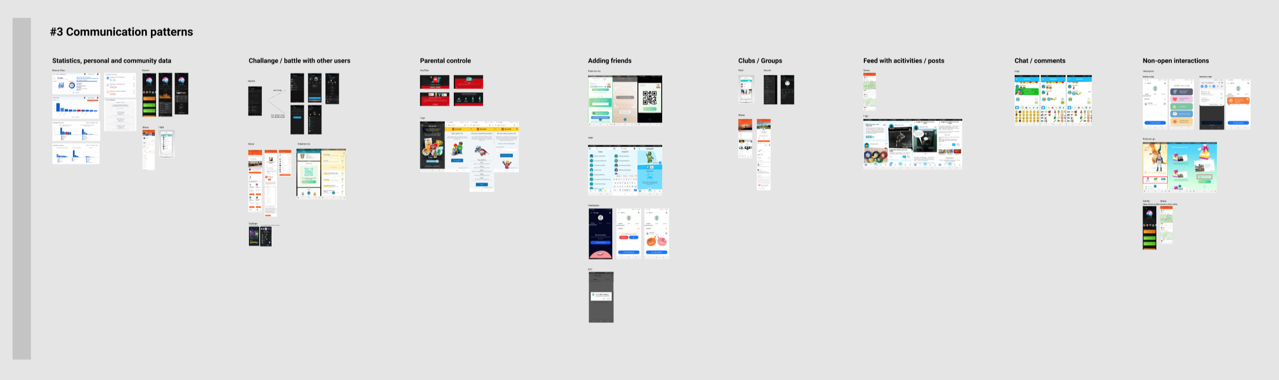
To get inspired and understand how other apps for children (and some for adults) utilize community features, I mapped out social features from 10 different apps.
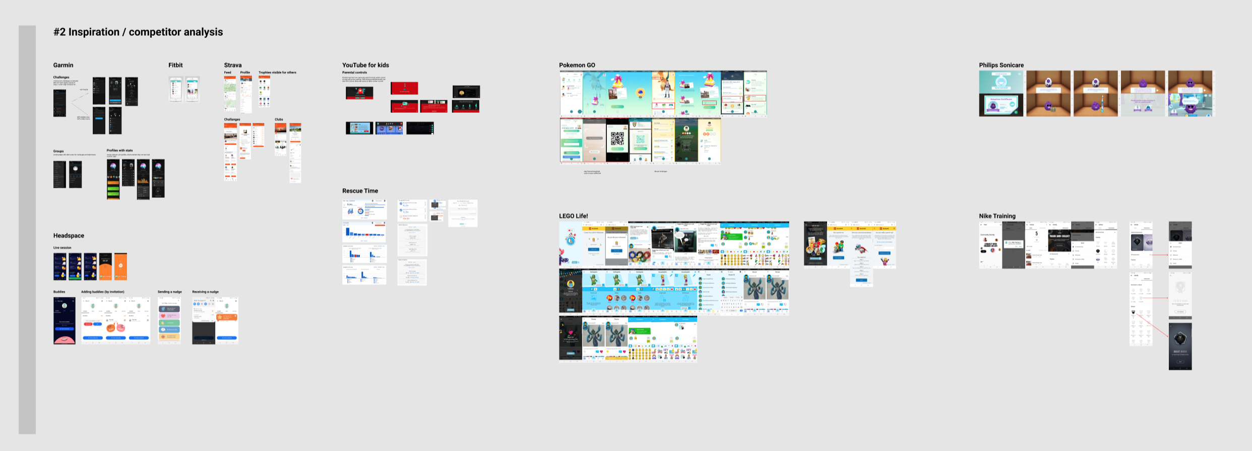
Together with the senior designer we put a list of apps using community features and dumped screenshots from them into Figma
After gathering these screenshots, I clustered them based on similar functionalities. This was an important step because it helped us understand the patterns that are already being used so we don’t have to reinvent the wheel.
Ideating community concepts for the CF Hero app
First, we wanted to create as many ideas as possible, to increase our chances of coming up with great concepts. We used the patterns of social interaction from other apps as inspiration.
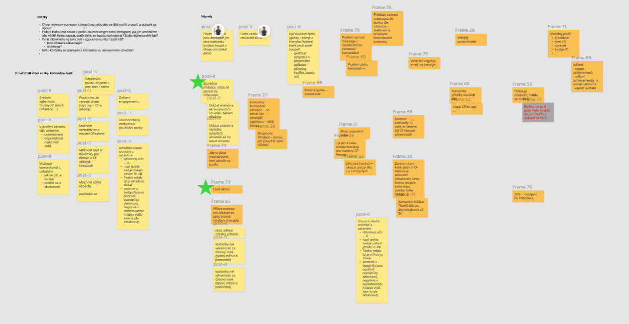
ideas for all the different concepts of how to create community in the app
We took the best ideas and started developing them into sketches. Sketches helped us to develop the ideas further, make them even better and involve other stakeholders. Especially the product manager and developers who contributed with more ideas and improved the existing ones.
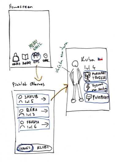
Sketch of one concept idea - profiles of other users which show their achievements
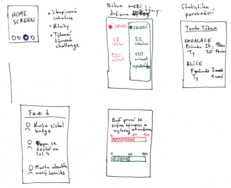
Sketch of another concept idea - two teams (green and red) competing in monthly challenges
After having a variety of sketches of different concepts, together with the product manager and the senior designer we selected the best concepts for testing with our users. Because kids find it hard to imagine how a concept would work just based on sketches, I turned them into high-fidelity mockups, a screen or two for each concept, so it would feel real for them and we would get more relevant feedback.
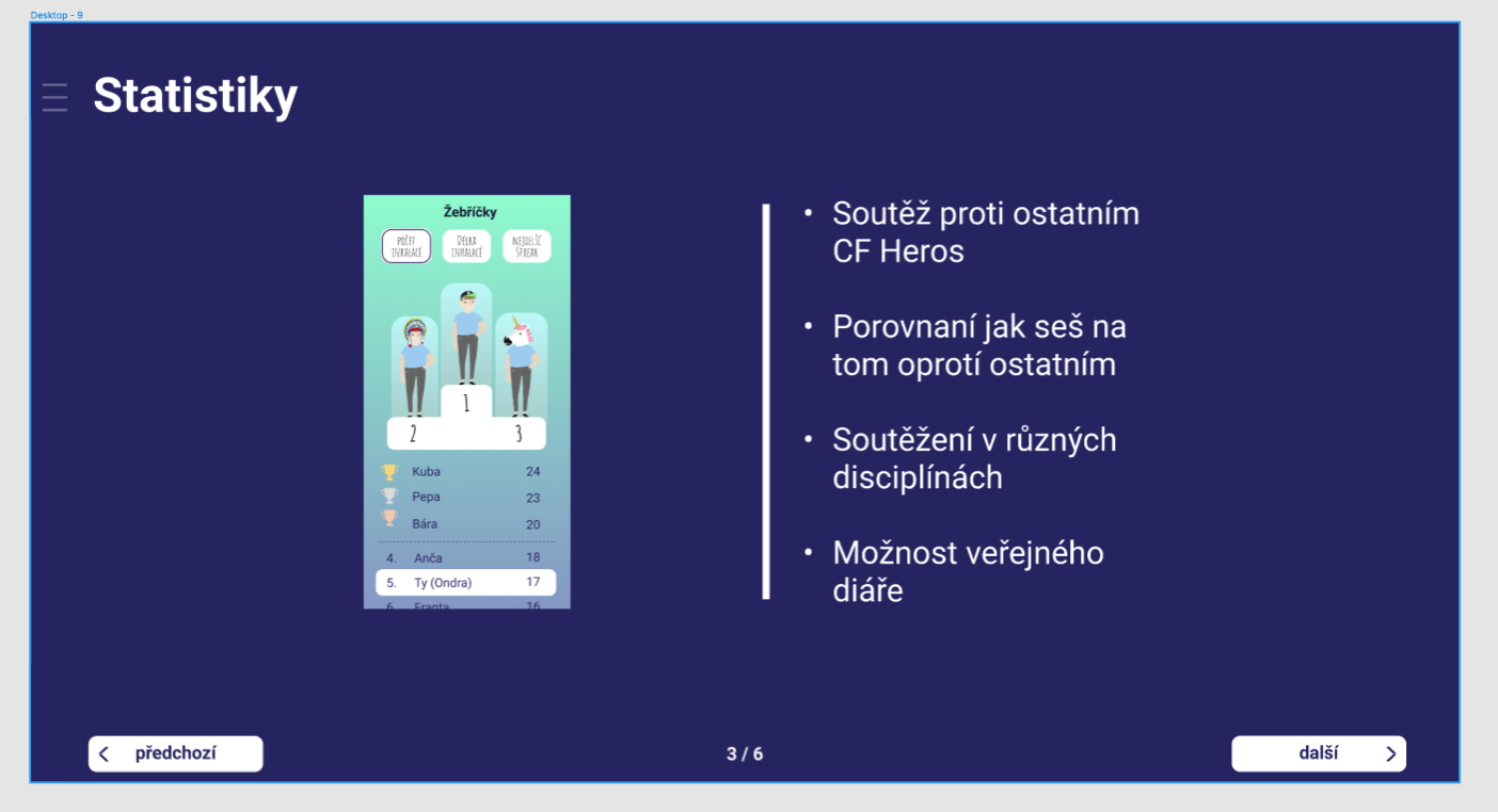
Mockup of “statistics” concepts where the children could see how they are performing in inhalations compared to other users in a specific month.
Testing which concepts would actually make kids feel like they are not alone
It is challenging to find out which concepts would work the best when interviewing children because they will say they like everything as they don’t want to disappoint the interviewer.
Therefore instead of “how do you like this concept?” we asked:
- What are your first impressions?
- Would you use this? Why yes or no? How?
- Do you know something similar from other apps?
- Do you have ideas on how this could be improved?
These more detailed questions enabled us to see what kids are excited and neutral about. And we could even co-create with them as they were giving us ideas for improvements and sharing their favourite functionalities from other games.
To figure out which concepts children found most attractive, we asked them: "Imagine you have 10 coins and you can decide which of these functionalities will be added to the app. How would you divide your 10 coins among these functionalities?"
Sketch of one concept idea - profiles of other users which show their achievements
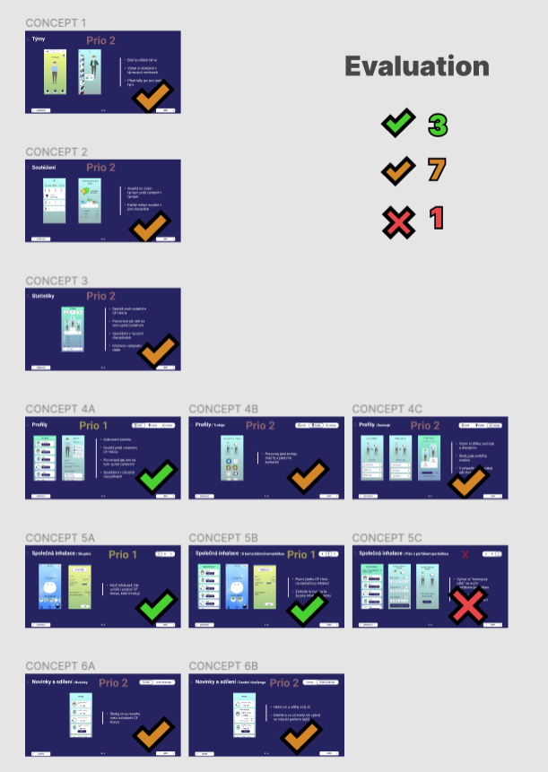
As a result of the testing, we had:
- 3 concepts which were the most promising
- 7 which could be potentially beneficial, but only with moderate value
- 1 concept was a complete miss
We evaluated the concepts based on
- how many kids wanted to include the features in the next version of the app
- how many kids were excited about the specific features
The two concepts we took forward were
- joint inhalations (public and with friends)
- and profiles of other users
Discussing concepts with the team
I brought the concepts to discuss with almost everyone on the team. This was important because:
- I gathered more feedback and could refine concepts
- Developers gave me and PM an initial idea about the feasibility of individual concepts
- Everyone on the team got familiar with the user response to the concepts, felt included and had ownership over the concepts.
REFLECTION: I should have asked the team for the concept feedback already before having the sessions with kids
Working out concepts into wireframes and flows
To develop the selected two concepts into features, I made many iterations of user flows in Figma while constantly discussing them with the Product Manager, Developers and the Senior Designer.
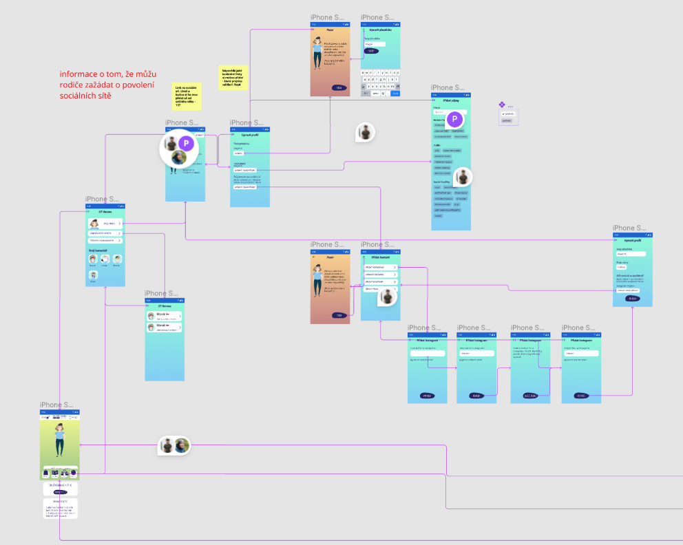
Part of the prototyped user flows. I asked for feedback both async and in dedicated meetings.
Testing “Joint inhalations” and “profiles” with kids with CF
We tested with 7 kids to:
- find out and fix any usability issues
- understand the impact of this feature in more depth
Prototype ready for testing
Main hypothesis/questions
Main hypothesis/ questions
Findings
1) When and why do want kids to do inhalations alone and when together with others?
→
In the morning they are in a rush and want to do it alone, otherwise always with others.
2) How does joint inhalation make them feel?
→
For the first time in their life, they feel they are not the only person in the world who needs to do inhalations, this is motivating.
3) How do kids want to use the “profiles” feature?
→
They want to look at children with similar interests and ages. Some of the kids want to connect with them on social media.
3) Are there any usability issues?
→
Yes, it is unclear if collecting rewards for inhalations is done together with other participants of joint inhalations, editing own profile is slightly confusing, plus a few more issues.
Based on the testing I created a report of all the findings.
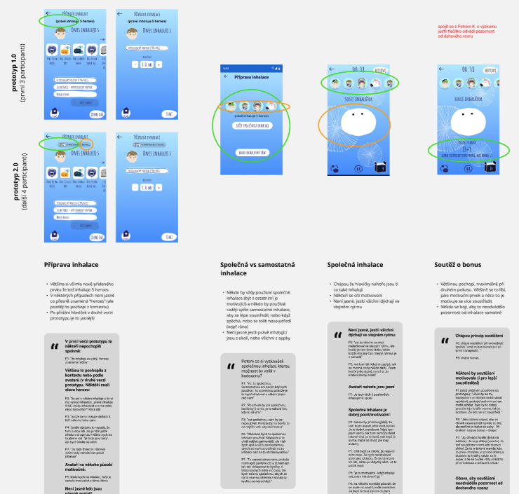
Part of the usability report. I colour-marked all the findings on the screen and complemented the screens with finding summaries and citations.
The report served well for:
- gathering all the findings in one place
- checking with the PM if I missed any findings (he participated in most of the sessions as note taker)
- communicating the findings to the visual designer and developers
- collecting evidence for the design choices
The report also enabled me to easily fix all the usability issues.
Preparing documentation for developers with visual designer
After the experience with the previous project I was involving developers in the process early enough so the handover was a lot smoother this time.
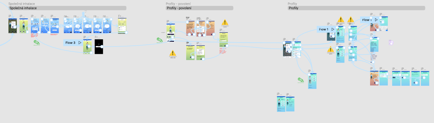
I prepared the final user flow with descriptions of the behaviour of the interface and then the visual designer polished all the elements of the screens.
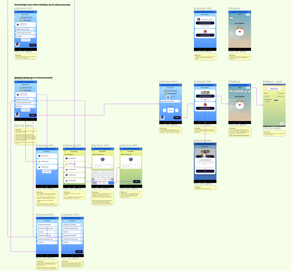
Part of the documented user flows with descriptions of UI behaviour
LEARNING: there were misunderstandings between me and the visual designer and we had to have a lot of back and forth. I believe I could have prevented this by involving him more earlier in the process.
After project
I again realised that involving team members in the design process is essential.
- Designing on my own sucks :(. I did enjoy the challenge of taking over all the UX responsibilities from the senior designer but the smaller frequency of discussions with another designer made my work less enjoyable.
- Not having another designer available for discussions meant involving other non-designers on the team was even more important to get feedback and eliminate flaws in the concepts. and designs.
- Not involving the UI designer towards the end of the process resulted in a lot of misunderstandings. It proved establishing close and continuous collaboration rituals with a UI designer is essential.
Petr, the senior designer I have worked with, says I'm an organised designer and empathetic facilitator.
Petr Kosnar about working with me:
"I was impressed how fast Ondřej got into an extremely complex and unusual context of a rare genetic disease, and was able to understand the limitations and challenges and started coming up with well established solutions. Ondřej was also very successful in steering the communication of broader team and improving information exchange leading to more efficient product development. He proved to be a good and empathetic facilitator of the research sessions with teenagers, which is a truly challenging target group for research, especially in the healthcare context. Working with Ondřej is a joy - he is well organized, has great and original yet realistic ideas, well established analytical thinking and solid toolbox of research and design methods. Thank you Ondřej for a great collaboration, I hope to work on more projects with you in the future!"
